목표
- 데이터를 훈련하기 전에 왜 전처리를 수행해야 하는지 원리를 깨닫는다.
머신러닝 목차 - https://wondangcom.tistory.com/2769
머신러닝 목차
머신러닝 1. 머신러닝 소개 1.1 인공지능이란 (혼공머신) - 4차산업 혁명 시대에 꼭 필요한 인공지능에 대해 알아 보자. 링크 : https://wondangcom.tistory.com/2771(2024.3.7) 1.2 머신러닝을 사용하는 이유 (핸
wondangcom.tistory.com
이번 시간에는 도미와 빙어 데이터를 최근접 이웃 모델로 분류하는 모델을 만들어 본다.
데이터 출처 : https://www.kaggle.com/datasets/vipullrathod/fish-market
Fish Market
Estimate the weight of a fish based on its species and the physical measurements
www.kaggle.com
1. 데이터 분석
- Species : 물고기 종류(Perch,Bream,Roach,Pike,Smelt)
- Weight : 무게
- Length1 : 세로 길이
- Length2 : 대각선 길이
- Length3 : 십자 길이
- Height : 높이
- Width : 대각선 너비
2. 데이터셋 로딩
구글드라이브 데이터 업로드 및 로딩 방법 : https://wondangcom.tistory.com/2312 참고
# prompt: 판다스를 이용해서 구글 드라이브에 있는 파일을 읽어 온다

import pandas as pd

# Change the path to the file you want to read
filename = '/content/drive/MyDrive/dataset/Fish.csv'

df = pd.read_csv(filename)

# Print the DataFrame
print(df)
구글 드라이브에 있는 파일을 판다스를 이용해서 불러 온 다음 산점도를 그려 보자.
# prompt: 데이터 중에 Bream 과 Smelt 에 해당하는 데이터만 산점도를 그린다. 단 Bream과 Smelt 를 구분해서 색상을 다르게 그린다.

bream_df = df[df['Species'] == 'Bream']
smelt_df = df[df['Species'] == 'Smelt']

# Create the scatter plot with different colors for Bream and Smelt
import matplotlib.pyplot as plt

plt.scatter(bream_df['Weight'], bream_df['Length2'], color='red', label='Bream')
plt.scatter(smelt_df['Weight'], smelt_df['Length2'], color='blue', label='Smelt')

# Add labels and title
plt.xlabel('Weight')
plt.ylabel('Length2')
plt.title('Scatter Plot of Bream and Smelt')

# Add legend
plt.legend()

# Show the plot
plt.show()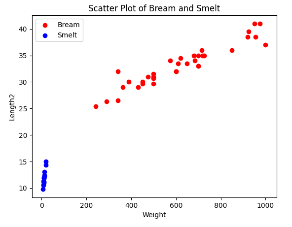
3. 독립데이터와 종속데이터
Bream은 0, Smelt 는 1 로 변경하여 종속데이터로 설정하고 독립데이터는 Weight와 Length2를 사용한다.
# prompt: 데이터 중에 Bream 과 Smelt 만 추출하고 타겟 데이터는 Species 특성을 사용하고 독립 데이터는 Weight,Length2 를 사용하도록 한다. 여기서 타겟데이터에서 Bream은 0,Smelt는 1 값으로 변경

# Extract data for Bream and Smelt
bream_df = df[df['Species'] == 'Bream']
smelt_df = df[df['Species'] == 'Smelt']

# Change target data values
bream_df['Species'] = 0
smelt_df['Species'] = 1

# Combine data into a single DataFrame
data_df = pd.concat([bream_df, smelt_df])

# Separate features and target
X = data_df[['Weight', 'Length2']]
y = data_df['Species']
4. 훈련세트와 테스트 세트 분할
1. 편향 데이터
# prompt: 훈련데이터를 처음부터 35개를 설정하고 나머지는 테스트 데이터로 설정한다.

train_data = data_df.iloc[:35]
test_data = data_df.iloc[35:]

X_train = train_data[['Weight', 'Length2']]
y_train = train_data['Species']

X_test = test_data[['Weight', 'Length2']]
y_test = test_data['Species']
먼저 편향된 데이터로 훈련을 했을 때 의 결과를 알아 보기 위해서 훈련세트를 bream, 테스트 세트를 smelt 로 분할 했다.
이렇게 편향 된 데이터로 훈련을 하면 테스트셋 결과는 모두 bream으로 예측을 할 것이다.
# prompt: 최근접 이웃 알고리즘을 이용해서 훈련 후 테스트셋의 점수를 알려줘

# Import Nearest Neighbors
from sklearn.neighbors import KNeighborsClassifier

# Create KNN classifier
knn = KNeighborsClassifier(n_neighbors=5)

# Train the classifier
knn.fit(X_train, y_train)

# Predict the labels for the test data
y_pred = knn.predict(X_test)

# Calculate the accuracy of the predictions
accuracy = knn.score(X_test, y_test)

# Print the accuracy
print(f"Test set accuracy: {accuracy * 100:.2f}%")
Test set accuracy: 0.00%
역시 하나도 맞출 수가 없었다.
이렇게 편향 되는 것을 해결 할 수 있는 것이 사이킷런의 train_test_split() 함수이다.
2. train_test_split() 을 이용하려 분할
# prompt: train_test_split() 함수를 이용해서 훈련세트와 테스트세트로 나눈다

from sklearn.model_selection import train_test_split

# Split the data into training and test sets
X_train, X_test, y_train, y_test = train_test_split(X, y,stratify=y, test_size=0.3, random_state=42)

# Create KNN classifier
knn = KNeighborsClassifier(n_neighbors=5)

# Train the classifier
knn.fit(X_train, y_train)

# Predict the labels for the test data
y_pred = knn.predict(X_test)

# Calculate the accuracy of the predictions
accuracy = knn.score(X_test, y_test)

# Print the accuracy
print(f"Test set accuracy: {accuracy * 100:.2f}%")
Test set accuracy: 100.00%
train_test_split 의 startify=y 매개변수는 y를 7:3의 비율로 나누어 준다.
테스트 세트의 점수가 100프로가 나온 것을 확인 할 수 있다.
5. 데이터 예측하기
- 대각선길이 25, 무게 150 인 물고기가 들어 왔는데 이 물고기는 무엇인지 예측해 보자.
# prompt: weight 150, Length2 25 을 예측한다

# Predict the species for a new data point
new_data_point = [[150, 25]]

# Predict the species
predicted_species = knn.predict(new_data_point)

# Print the predicted species
print(f"Predicted species: {predicted_species}")
Predicted label for new data point: [1]
1(Smelt)이라고 예측했다.
이 위치를 산점도 위치에 마킹해 보자.
# prompt: weight 150, Length2 25 을 위의 산점도 위치에 마킹 해 줘

# Import matplotlib.pyplot
import matplotlib.pyplot as plt

# Create the scatter plot with different colors for Bream and Smelt
plt.scatter(bream_df['Weight'], bream_df['Length2'], color='red', label='Bream')
plt.scatter(smelt_df['Weight'], smelt_df['Length2'], color='blue', label='Smelt')

# Add labels and title
plt.xlabel('Weight')
plt.ylabel('Length2')
plt.title('Scatter Plot of Bream and Smelt')

# Add legend
plt.legend()

# Mark the new data point with a black star
plt.scatter(150, 25, color='black', marker='*', label='New Data Point')

# Show the plot
plt.show()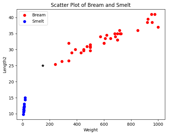
* 위치가 예측한 데이터의 위치이다. 산점도로 보면 Bream 에 가까운 것을 알 수 있다.
그렇다면 무엇이 잘못 된 것일까?
바로 무게와 길이의 단위 차이 때문에 생긴 것이다.
산점도의 길이를 1000으로 맞춰서 그려 보자.
# prompt: 산점도의 범위를 x축과 y축 모두 1000 까지로 맞추어서 그려 줘

# Create the scatter plot with different colors for Bream and Smelt
plt.scatter(bream_df['Weight'], bream_df['Length2'], color='red', label='Bream')
plt.scatter(smelt_df['Weight'], smelt_df['Length2'], color='blue', label='Smelt')

# Add labels and title
plt.xlabel('Weight')
plt.ylabel('Length2')
plt.title('Scatter Plot of Bream and Smelt')

# Add legend
plt.legend()

# Mark the new data point with a black star
plt.scatter(150, 25, color='black', marker='*', label='New Data Point')

# Set the x and y axis limits
plt.xlim(0, 1000)
plt.ylim(0, 1000)

# Show the plot
plt.show()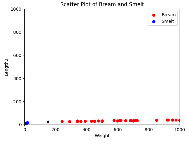
최근접 이웃으로 선택된 데이터를 녹색으로 그려 보자.
# prompt: 여기서 예측 데이터가 참고한 데이터 5개를 다른 색으로 표현해 줘

# Find the 5 nearest neighbors
neighbors = knn.kneighbors(new_data_point)[1][0]

# Create a scatter plot with different colors for Bream and Smelt
plt.scatter(bream_df['Weight'], bream_df['Length2'], color='red', label='Bream')
plt.scatter(smelt_df['Weight'], smelt_df['Length2'], color='blue', label='Smelt')

# Add labels and title
plt.xlabel('Weight')
plt.ylabel('Length2')
plt.title('Scatter Plot of Bream and Smelt')

# Add legend
plt.legend()

# Mark the new data point with a black star
plt.scatter(150, 25, color='black', marker='*', label='New Data Point')

# Mark the 5 nearest neighbors with green circles
for i in neighbors:
    plt.scatter(X_train.iloc[i]['Weight'], X_train.iloc[i]['Length2'], color='green', marker='o')

# Set the x and y axis limits
plt.xlim(0, 1000)
plt.ylim(0, 1000)

# Show the plot
plt.show()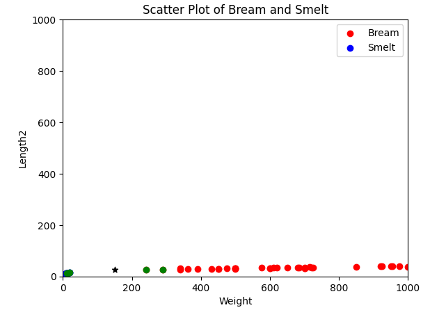
knn.kneighbors 은 예측값과 가까운 데이터의 거리,인덱스값을 가지고 있는데 여기서는 인덱스를 사용했다.
산점도를 살펴 보면 Bream 데이터 2개와 Smelt 데이터 3개를 참고하였다.
Length2 의 범위가 미미하여 Weight 의 크기가 영향을 많이 주었다는 것을 알 수 있다.
따라서 정확한 데이터를 예측하기 위해서는 기준을 맞추는 작업이 필요하다.
6. 데이터 표준화
이렇게 두 특성의 스케일이 다를 때 가장 널리 사용하는 전처리 방법중 하나가 표준점수이다.
표준점수는 원점수가 정규분포를 따른다고 가정하고 다음의 공식을 통해 변환한 점수를 의미한다.
z = (원점수 - 시험평균)/표준편차
시험을 볼 때 원점수는 시험의 난이도를 반영하지 못하고 수험자의 상대적 위치를 알 수 없지만 표준점수는 상대적 위치를 알 수 있기 때문에 대학수학능력시험이나 지능지수 검사 등에서 사용된다.
1. 표준 점수 계산하기
import numpy as np
mean = np.mean(X,axis=0) #평균
std = np.std(X,axis=0) #표준편차
X_scaled = (X - mean)/std
위와 같이 파이썬으로 직접 계산 할 수 있지만 사이킷런에서 StandardScaler를 이용해서 표준점수를 구할 수 있다.
# prompt: Length2 와 Width 를 표준점수로 계산해 줘

from sklearn.preprocessing import StandardScaler

# Create a StandardScaler object
scaler = StandardScaler()

# Fit the scaler to the data
scaler.fit(X)

# Transform the data
X_scaled = scaler.transform(X)
2. 표준 점수 데이터로 다시 훈련하기
# prompt: 표준점수 데이터를 가지고 최근접이웃 모델로 다시 훈련해 줘

# Split the data into training and test sets
X_train, X_test, y_train, y_test = train_test_split(X_scaled, y, stratify=y, test_size=0.3, random_state=42)

# Create KNN classifier
knn = KNeighborsClassifier(n_neighbors=5)

# Train the classifier
knn.fit(X_train, y_train)

# Predict the labels for the test data
y_pred = knn.predict(X_test)

# Calculate the accuracy of the predictions
accuracy = knn.score(X_test, y_test)

# Print the accuracy
print(f"Test set accuracy: {accuracy * 100:.2f}%")
Test set accuracy: 100.00%
3. 이 모델로 무게 150,길이 25를 다시 예측해 보자.
# prompt: 이 모델로 weight 150, Length2 25 을 예측한다

# Create a new data point
new_data_point = [[150, 25]]

# Scale the data point
new_data_point_scaled = scaler.transform(new_data_point)

# Predict the species
predicted_species = knn.predict(new_data_point_scaled)

# Print the predicted species
print(f"Predicted species: {predicted_species}")
Predicted species: [0]
0(Bream) 으로 정상적으로 예측했다.
산점도를 그려 보자.
# prompt: bream_df 와 smelt_df를 표준점수로 변환하고 이 데이터를 이용해서 예측데이터와 함께 산점도를 그려줘,표준점수 변환시 scaler를 사용한다

# Standardize bream_df and smelt_df
bream_df_scaled = scaler.transform(bream_df[['Weight', 'Length2']])
smelt_df_scaled = scaler.transform(smelt_df[['Weight', 'Length2']])

# Create a scatter plot with different colors for Bream and Smelt
plt.scatter(bream_df_scaled[:, 0], bream_df_scaled[:, 1], color='red', label='Bream')
plt.scatter(smelt_df_scaled[:, 0], smelt_df_scaled[:, 1], color='blue', label='Smelt')

# Add labels and title
plt.xlabel('Weight (standardized)')
plt.ylabel('Length2 (standardized)')
plt.title('Scatter Plot of Bream and Smelt (standardized)')

# Add legend
plt.legend()

# Mark the new data point with a black star
plt.scatter(new_data_point_scaled[0][0], new_data_point_scaled[0][1], color='black', marker='*', label='New Data Point')

# Show the plot
plt.show()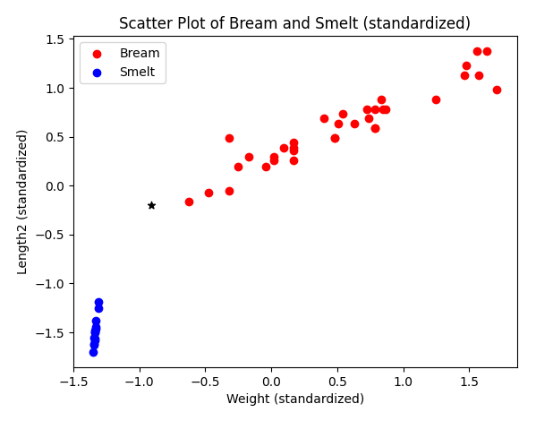
표준 점수로 만든 다음 산점도까지 그려 보았다.
우리는 이 시간에 왜 데이터의 특성을 표준화 해야 하는지 살펴 보았다.
참고) 혼자 공부하는 머신러닝(한빛미디어)
'강의자료 > 머신러닝' 카테고리의 다른 글
| 3.2 경사 하강법 (6) | 2024.05.20 |
|---|---|
| 3.1 선형 회귀 (7) | 2024.05.09 |
| 2.1 데이터 다루기 - 산점도 그려 보기(캐글 데이터셋 남자와 여자 분류) (3) | 2024.04.25 |
| 2.1 데이터다루기 - 최근접 이웃 분류 (10) | 2024.04.19 |
| 1.6 머신러닝 과정 (0) | 2024.04.11 |